AP Art of the Week
Spotlight on Artist Augustin Donaldson-Saul
The Elective’s digital art museum this week features a digital illustration made by Augustin Donaldson-Saul from Arlington High School in Arlington, Massachusetts.
Welcome to The Elective’s digital art museum, dedicated to the incredible work of AP Arts students. Each week we highlight a work or series created in one of the AP Arts concentrations—AP 2-D Art and Design, 3-D Art and Design, and AP Drawing (the AP Program also offers Art History and Music Theory)—as well as a statement from the artist (and, occasionally, their teacher).
From the first cave paintings to contemporary breakthroughs in virtually reality, art, in all its forms, has been a crucial way for people to process, make sense of, comment on, and grapple with the world around them. After more than a year of life in a pandemic, AP Art students have risen to the challenge of processing and making sense of the challenges—and opportunities—that have come from this perilous time. The work they submitted in their final portfolios is explicitly of the moment. It’s often challenging and provocative, but always insightful, inspiring, and expansive.
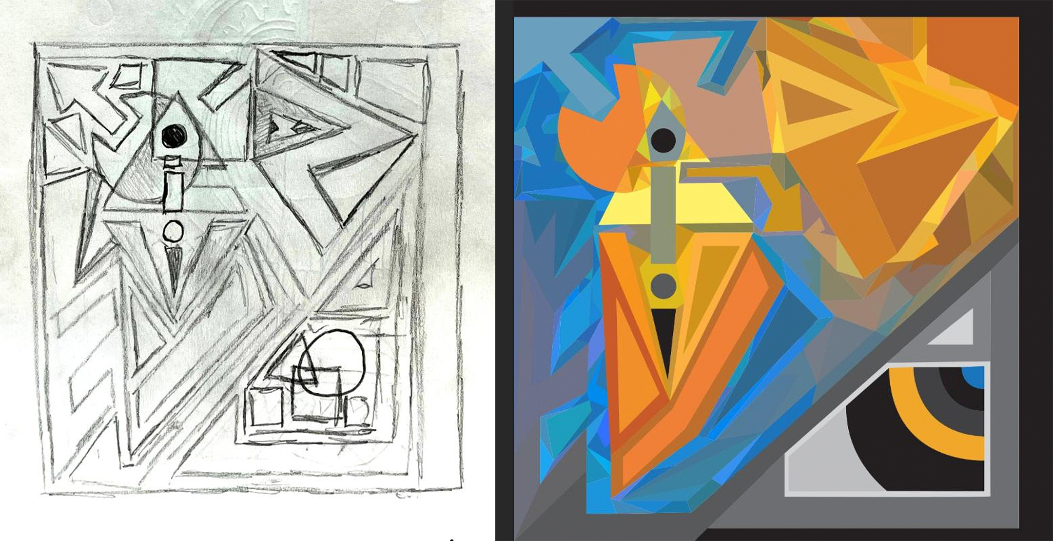
This week we feature a digital illustration made by Augustin Donaldson-Saul from Arlington High School in Arlington, Massachusetts.

Here’s Augustin’s statement on the work:
“The title of this main piece of work is We Three. Before I got to creating it, I was slowly but surely gaining an idea of what my sustained investigation would target. I’ve always loved music—especially the ‘old’ or ‘vinyl’ variety—so I figured I should celebrate that. Yet I still needed an actual form of art, which is where I found contemporary, yet jazz-age cubism. It was a form of art you didn't see much, but I personally felt like it fit perfectly with what I was going for. It was something I felt like you’d see on a record album or two (a few years back, that is). Simple yet sophisticated, so to speak, and this piece and the others in my portfolio have clear indications that I followed this set of rules: not too many colors in one image, keep the image centralized yet all over the place, so and so forth. None of the first images really ‘symbolized’ something; they were more of a celebration for something I enjoyed.
“At a certain point, I had a single slot left to fill in my sustained investigation. All of my previous images had a draft and a final, so this one was going to be a ‘one-and-done,’ if you will. However, I felt like this one needed to mean something. All of my other images were an homage to music—nothing more. I recalled that I struggled with isolation and independence in portions of high school, so I chose to create something out of that. In We Three, there is a collection of (you guessed it) three forms, three faces. I went after that saying ‘see no evil, hear no evil, speak no evil’ in the beginning as a muse of sorts. While this is more of an anti-bystander phrase, I used it as I recalled myself being extremely reserved for a good chunk of high school, as if I was completely lacking all my social senses (sight, speech, hearing). So yes, you’ll see these faces sort of separate and converge, and blot out their senses. At the same time, I wanted to completely ignore my ‘color’ rule, as a reference to the fact that it was my creative juices that kept me going during parts of the last four years. In other words, art and music—which is what made my art what it is in the first place.”
And here are a couple other works from Augustin’s portfolio:

Used Adobe Illustrator pen to make the form, then used color tools to finalize the image.
Based off records from the '50s/'60s, I used opposite colors to make it pop. After creating a paper draft, I used Adobe Illustrator tools to create the final design. I started by forming image with pen tool, finalized with certain shape/color tools.
Student statements are lightly edited for length and clarity.

